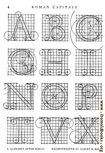
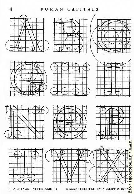
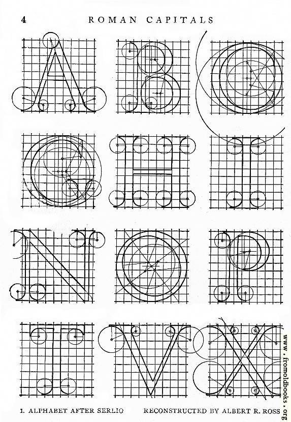
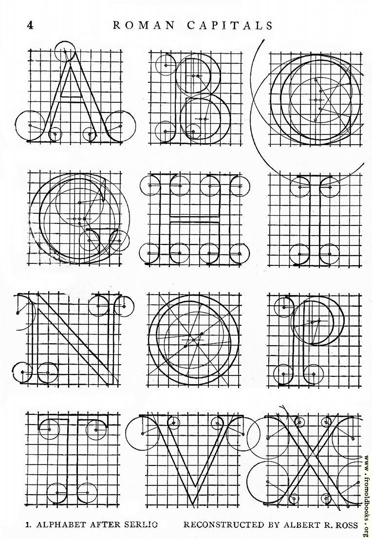
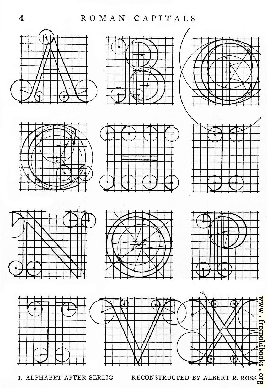
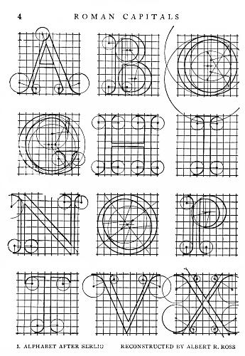
![[Picture: 1.—Alphabet After Serlio, Reconstructed by Albert R. Ross.]](https://www.fromoldbooks.org/Brown-LettersAndLettering/pages/001-Alphabet-After-Serlio/001-Alphabet-After-Serlio-q75-429x622.jpg "[Picture: 1.—Alphabet After Serlio, Reconstructed by Albert R. Ross.]")
Download
Buy print-size file for commercial or other use
About
1.—Alphabet After Serlio, Reconstructed by Albert R. Ross. more
Buy print-size file for commercial or other use
1.—Alphabet After Serlio, Reconstructed by Albert R. Ross. more
Constructed capitals: diagram showing how to draw letters with rulers and compasses against a grid.
“An excellent model for constructing the Roman capitals in a standard form will be found in the beautiful adaptation by Mr. A. R. Ross, [Fig. 1] and [Fig. 2], from an alphabet of capitals drawn by Sebastian Serlio, an Italian architect, engraver and painter of the sixteenth century, who devised some of the most refined variants of the classic Roman letter. Serlio’s original forms which are shown in [Fig. 39] and [Fig. 40], were intended for pen or printed use; but in altering Serlio’s scheme of proportions it will be observed that Mr. Ross has partially adapted the letter for use in stone, and has further varied it in details, notably in serif treatment. In most modern stone-cut letters, however, the thin strokes would be made even wider than in this example, as in [Fig. 14]. Mr Ross’s adaptation shows excellently how far the classic letters do or do not fill out the theoretical square.”
The book has suffered some damage, possibly from water, on this page, at some time in the past, so that the pages must have stuck together, and this has affected the letters G and (on the facing page) M and S, I have attempted to reconstruct them. I have also saved the individual letters in case they are useful.
The alphabet is (by modern standards) incomplete; for J and U you will have to use I and V, and for W use VV.