This site may be going away; please consider the Donate link above... or LiberaPay:

A huge thank you to all who donate; 2026 Q3 Web hosting $52.02 / $300.
This site may be going away; please consider the Donate link above... or LiberaPay:
A huge thank you to all who donate; 2026 Q3 Web hosting $52.02 / $300.
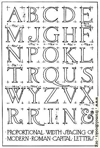
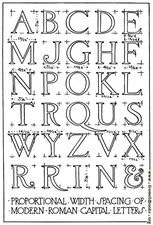
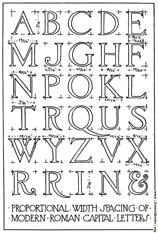
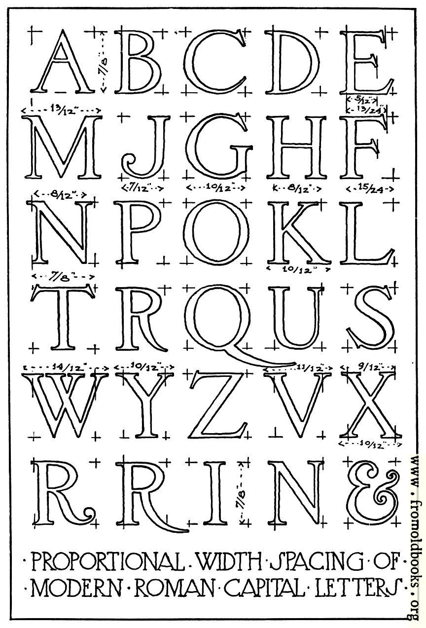
![[Picture: 3.—Width Proportions of Modern Roman Capitals.]](https://www.fromoldbooks.org/Brown-LettersAndLettering/pages/003-Proportions/003-Proportions-q75-486x716.jpg "[Picture: 3.—Width Proportions of Modern Roman Capitals.]")
Buy print-size file for commercial or other use
Width proportions, which may be found useful in laying out lettering for lines of a given length, are shown in [Fig. 3] in a more modern style of the Roman capital. In the classic Roman letter the cross-bar is usually in the exact center of the letter height, but in 3 the center line has been used as the bottom of the cross-bar in b, e, h, p, and r, and as the top of the cross-bar in a; and in letters like k, y and x the “waist lines,” as the meeting-points of the sloping lines are sometimes called, have been slightly raised to obtain a more pleasant effect.” (p. 6)
The diagram is signed F.C.B., which I take to denote the author of the book, Frank Chouteau Brown.
Social Media