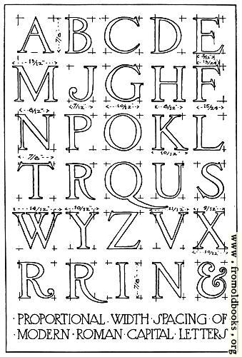
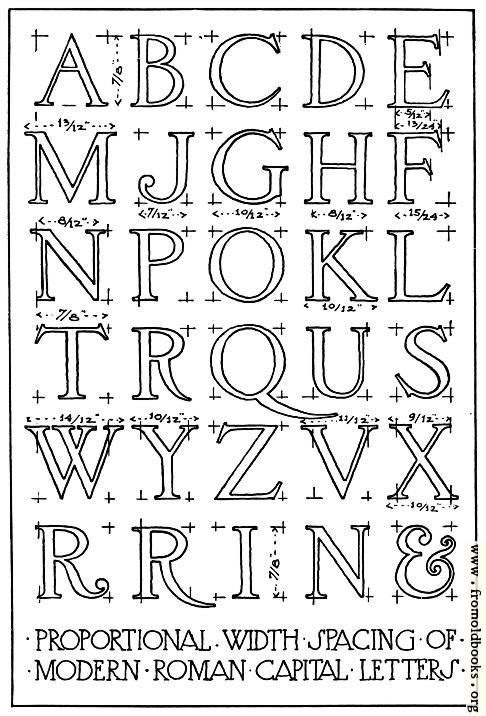
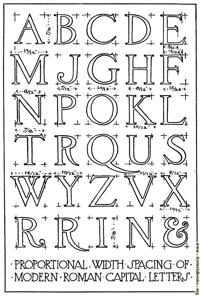
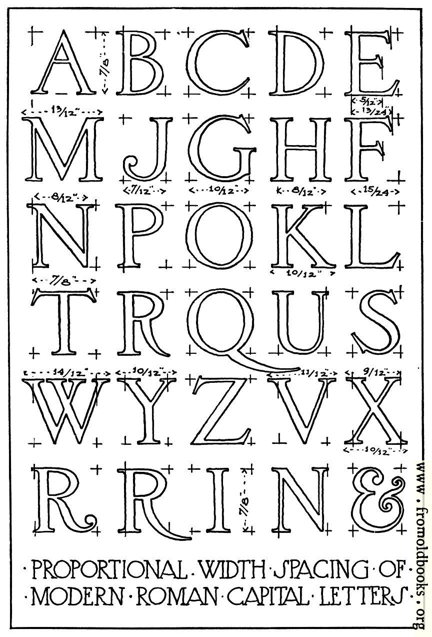
3.—Width Proportions of Modern Roman Capitals. details

Download pages:
339x500 45K
486x716 73K
648x955 111K
864x1273 169K
1727x2545 435K
Arts blogs
Top Blogs
3.---Width Proportions of Modern Roman Capitals.
Image title: 3.—Width Proportions of Modern Roman Capitals.
Source: Brown, Frank Chouteau: “Letters & Lettering: A Treatise With 200 Examples” (1921)
Place shown: none
Keywords: lettering, alphabets, diagrams, greyscale
Status: public domain in the USA, out of copyright in Canada, hence royalty-free stock image for all purposes and no usage credit required

Notes:

“Width proportions, which may be found useful in laying out lettering for lines of a given length, are shown in [Fig. 3] in a more modern style of the Roman capital. In the classic Roman letter the cross-bar is usually in the exact center of the letter height, but in 3 the center line has been used as the bottom of the cross-bar in b, e, h, p, and r, and as the top of the cross-bar in a; and in letters like k, y and x the “waist lines,” as the meeting-points of the sloping lines are sometimes called, have been slightly raised to obtain a more pleasant effect.” (p. 6)

The diagram is signed F.C.B., which I take to denote the author of the book, Frank Chouteau Brown.

Dimensions: 88 x 132mm (3.5 x 5.2 inches)
Filename: 003-Proportions-q75-339x500.jpg
Artist: Frank Chouteau Brown
Comment: Add a link, leave a comment or change keywords

$Id: mkgallery,v 1.64 2008/01/02 04:05:10 lee Exp lee $

Valid XHTML 1.0! Valid CSS!