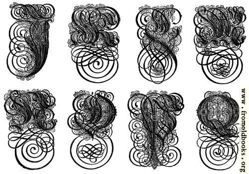
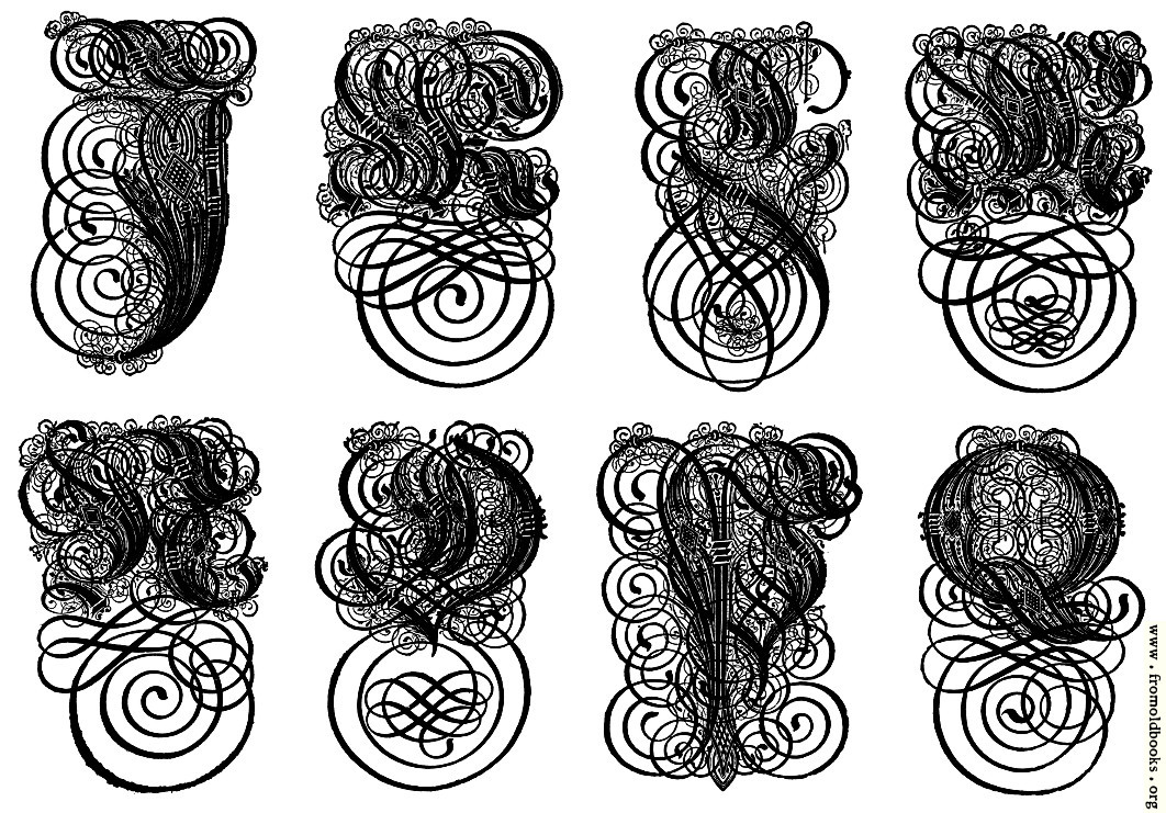
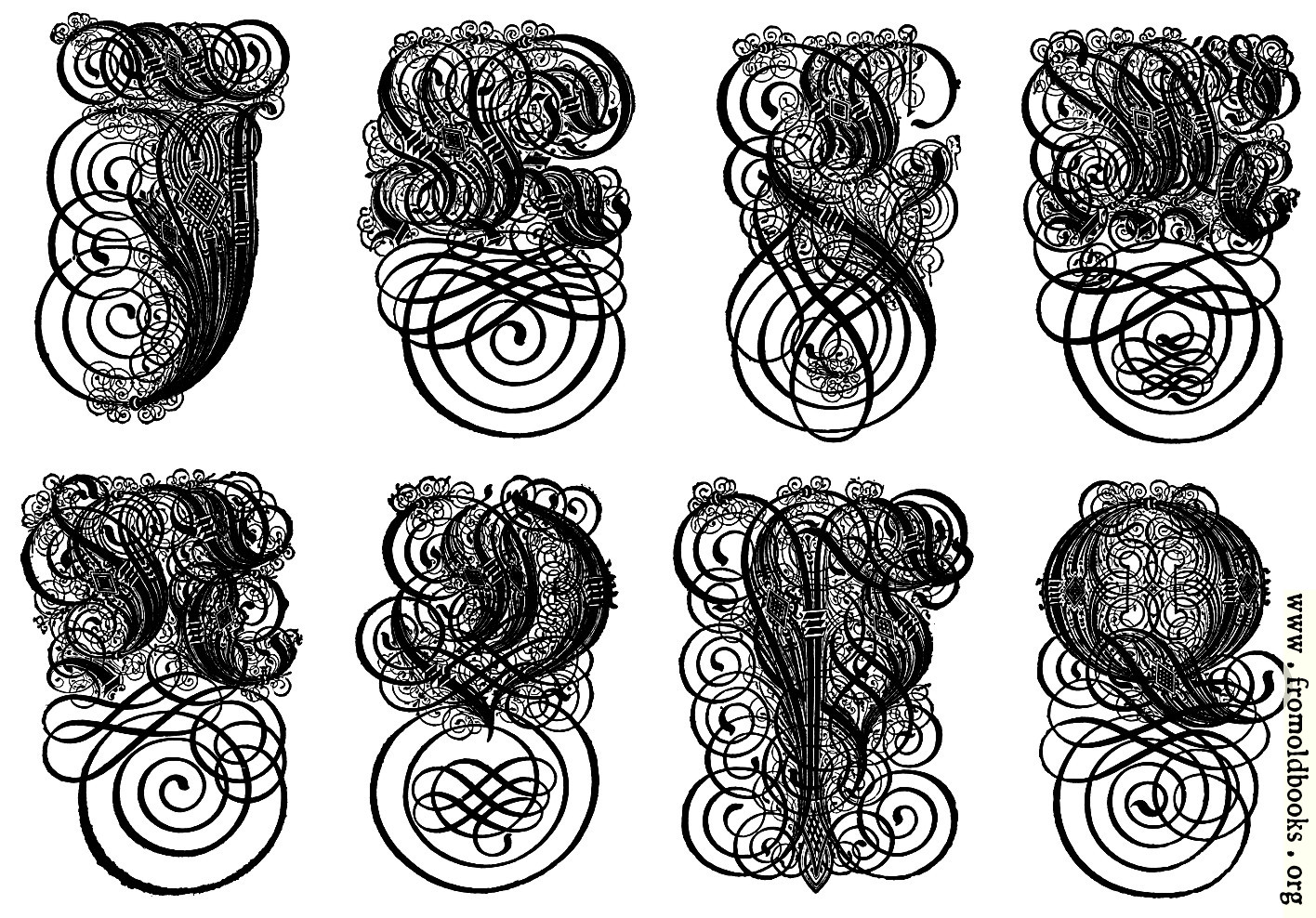
| 500x349 | 55K | jpg free download |
| 119x83 | 4K | jpg free download |
| 797x556 | 182K | jpg free download |
| 1062x741 | 308K | jpg free download |
| 1416x988 | 507K | jpg free download |
| Image title: | 168.—German Gothic Initials (J to Q) |
|---|---|
| Source: | Brown, Frank Chouteau: “Letters & Lettering: A Treatise With 200 Examples” (1921) |
| Place shown: | none |
| Keywords: | alphabets, calligraphy, fraktur, lettering, greyscale |
| Status: | out of copyright (called public domain in the USA), hence royalty-free stock image for all purposes usage credit requested Please do not redistribute without permission, since running this site is expensive. |
Figures 167 to 169 show a more elaborate but an excellent and typical variety of this form of capital, which is one of the most beautiful and distinctive of Gothic letters. Shorn of its fussy small lines the main skeleton is eminently virile; and, though extremely difficult to draw, it cannot be surpassed for certain limited uses. (p. 140) There is no letter I; use the J instead. See also A-H for links to individual letters in the first plate. |
|
| Filename: | 168-German-Gothic-Initials-J-Q-500x349.jpg |
| Blog image: | http://fromoldbooks.org/r/4/168-German-Gothic-Initials-J-Q-500x349.jpg |
| Blog link: | http://fromoldbooks.org/r/4/pages/168-German-Gothic-Initials-J-Q/ |
| Scanner dpi: | 2400 |
| Comment: | Add a link, leave a comment or change keywords |