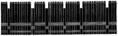
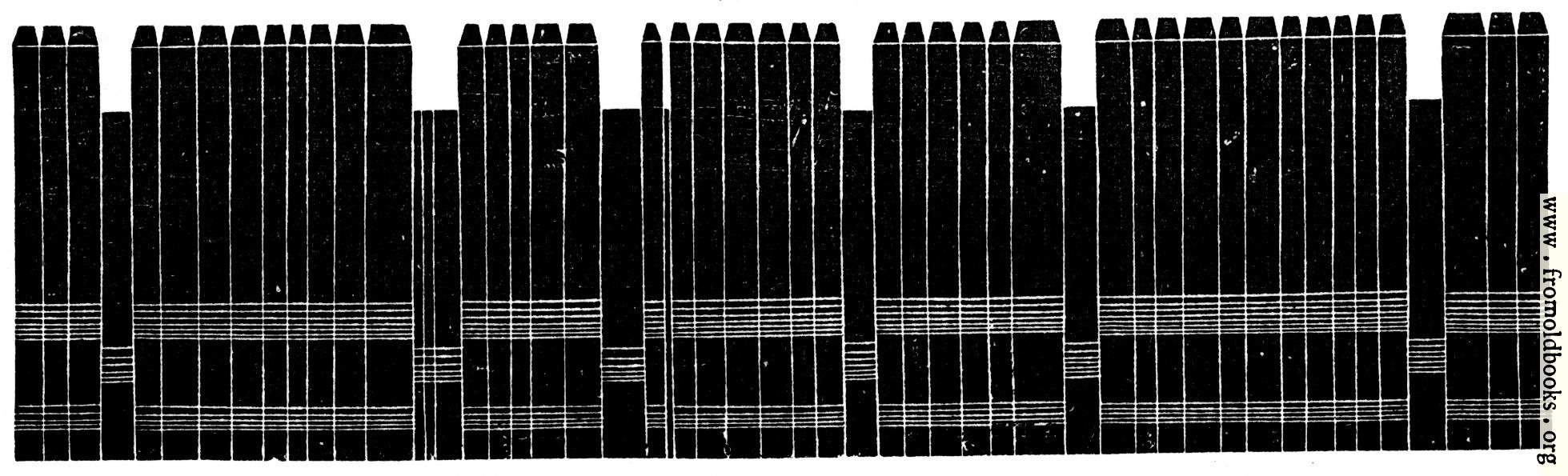
![[Picture: A Line of Composed Type]](https://www.fromoldbooks.org/Blades-Pentateuch/pages/053b-line-of-composed-type/053b-line-of-composed-type-q75-1959x595.jpg "[Picture: A Line of Composed Type]")
Download
Buy print-size file for commercial or other use
About
A Line of Composed Type more
Buy print-size file for commercial or other use
A Line of Composed Type more
When the end of a line was reached, and there was no room for more words and yet some space left, the compositor by placing a little extra space between the words made the line fill out the stick. This was called ‘justifying” the line. Each line was lifted out of the stick and placed on a wooden board; thus line after line was added until there were enough for a page.” (p. 52)
The diagram shows a line of (cold metal) type from the side; at the top of the illustration is the part that would touch the paper to make the impression. The shorter pieces are spaces, well out of the way of accidentally getting inked.